
The Wisconsin flag is a travesty
Why the state needs to make a change
More stories from Winter Heffernan
What is the essence of Wisconsin? If you close your eyes and think about it, what images come to mind? Wisconsin is known for dairy, brewing companies, the Northwoods and a myriad of other icons.
Whatever image you conjured, I can assure you it isn’t the abomination that is our state flag. Where do I begin with this conflagration of bad design choices?
Thankfully, there are heroes out there. Not heroes we deserve, but heroes we need, vexillologists. Vexillology, or the study of flags, is an area of interest to many people, so much so that there is a 16 page booklet on flag design.
“Good Flag, Bad Flag” is a handbook created by the North American Vexillological Association. It has five rules that have become orthodox in the flag designing community. These five rules will guide my judgment of the Dairy State’s flag.
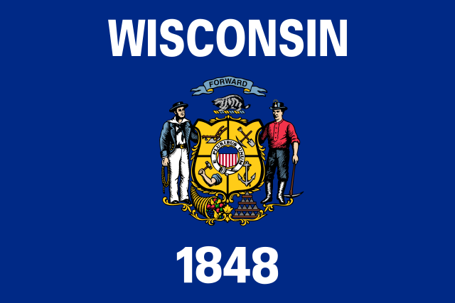
Rule one: “Keep it simple. The flag should be so simple that a child can draw it from memory.”
Can you draw the Wisconsin flag? So much so that someone in the United States can recognize it? I am assuming that you, the reader, are not a child.
Simplicity is important to icon creation. If something is too complex, it is harder to recognize; it won’t instantly conjure an idea into your head. Think of a logo, it needs to be simple enough to kick you in the gut with what it is, what they do, and why they do it.
Wisconsin’s flag does not fit the bill.
Rule two: “Use Meaningful Symbolism.”
The Wisconsin flag adheres to this rule, partially. It has a badger on it, and a few symbols showing industries that appear in wisconsin.
The problem is that all these symbols are so small that you can hardly see any of them from a distance. There are too many of them to fit on a flag, and a few of them are industries, that while still here, are less prevalent than they used to be (Mining and Sailing).
The symbolism is hard to read and some of it is outdated.
Rule three: “Use 2 or 3 basic colors.”
As mentioned above, simplicity is important. Additionally too many colors in a small space can appear gaudy and overwhelming.
The fact that I lost count of how many colors are on the Wisconsin flag is a bad sign. Needless to say, there are far more than three.
Rule four: “No Lettering or Seals.”
If you have to label what your flag is representing, you have probably done a bad job at making a symbol. You should know what you are looking at without having to read “WISCONSIN” printed in ugly letters on the flag.
Another problem with lettering is that it can’t be read backwards; the other side of the flag won’t be able to be read. You shouldn’t have to make a two sided flag.
Seals are oftentimes way too detailed for a flag. They get crammed in the flag and are so small that you can recognize them.
This, in my opinion, is the worst sin that Wisconsin’s flag commits. The lettering is overbearing and ugly. The seal is small and gaudy.
Rule five: “Be Distinctive or Be Related.”
A flag should not be mistaken for another flag. At a distance you shouldn’t mistake it for another flag. A flag can have relations, connections and references to other flags, but it shouldn’t be so similar that they look exactly the same.
The Wisconsin flag is primarily a blue flag with a seal.There are 23 other state flags that follow the exact same pattern. Many of them are very difficult to make out from each other. This is not a problem exclusive to Wisconsin; this is an epidemic of bad flags.
In conclusion, the state flag of Wisconsin breaks all five rules to some degree. As a resident of Wisconsin, I am ashamed of our flag.
This is an outcry, a rallying call. Our flag needs to be changed. A state flag has been changed before; there is precedent. We need a symbol that captures “the essence of Wisconsin.”
Heffernan can be reached at [email protected]